Benefit Harbor Employee Self-service is an employee driven application for benefit Enrollment. It is 24x7 access for employees to view and enroll benefits. Self-Service Application first version was released in 2008, Since 2008 Application keeps adding features as per client, broker and employer feedback. Each year after the benefit enrollment season is over most likely from February. Operation, Sales and development team working together and in start improving application based on feedback.
Primary Goal
Redesign Employee Self-service application and address key pain points of the current Employee self-service application.
My Role
Lead product designer from Prototyping, Delivery of high fidelity mock-up specification to developer team Convert wireframe into HTML. Involved in redesign and refreshing User Journey map.
Limitation
Enrollment flow is proven with current users and we can’t change flow.

 Define
What are the problems this project attempts to solve? What do we want to achieve? How will we know if we're successful?
With the help of a marketing research consultant and call center team we were able to gain valuable insights and identify current Pain points
Current Pain Points
Summary of key pain points based on in-depth analysis of current platform
- Lack of interest from both employers and their employees.
- Products that don't fit platform
- Employees are lost before they even begin their benefits journey.
- Employees are not involved with their benefits.
- Everyone wants employees to pick plans that acutely fit them.
- Product placement in the workflow is critical for everyone's success.
- Carriers feel their products are currently being poorly presented to customers.
- Poor placement is hurting enrollment, engagement and usage.
Strategy Canvas
Mapping key value drivers across
the competitive landscape to narrow
strategic focus
Key Value Drivers
- Mobile
- Enrollment UX
- Plan Comparison
- Employee Engagement
- Educational Content & Tools
- Customer Service
- Enrollment Accuracy
Competitors Analyzed
Top Competitors Analyzed
- Businessolver
- Empyrean
- PlanSource
- BenefitFocus
 Ideate
What are the ideas? What are possible solutions?
We looked at several direct and indirect competitors to help with the ideation
process we are able to gain valuable insights in:
- More frequent engagement from employees
- UX/UI that is easy for employees to understand and utilize for enrollment and ongoing management of elections
- Better communication, cadence, and product placement regarding benefits
- Service and systems that work together to support plan provisions and ensure accurate enrollment
- Self service platform to optimize enrollment
- Add a new features of Plan Comparison with different product
- Design a new application in responsive layout
Employee Self-service user journeys
After Analysis and brainstorm. With the help of the operation team we designed
a User Journey map.
 Prototype
Rapid prototyping and ideation >through divergent thinking
How can the ideas be represented? What needs to be created in order to test with users?
We initially used divergent thinking to prototype several approaches at the component level (Dashboard, Prodouct Enrollment, Employee Tracker, etc.), as well as, design how the information is organized on the overall page.
Divergent thinking is… a thought process or method used to generate creative ideas by exploring many possible solutions. It typically occurs in a spontaneous, free-flowing, ‘non-linear’ manner, such that many ideas are generated in an emergent cognitive fashion. Many possible solutions are explored in a short amount of time, and unexpected connections are drawn.
Image from UX Think
Developing a prototype to test through convergent thinking
Then we leaned into our convergent thinking to arrive at a single prototype to user test.
Convergent thinking is… the type of thinking that focuses on coming up with the single, well-established answer to a problem. It often requires critical thinking and consciously using standards and probabilities to form judgements to arrive at a solution.
Employee Dashboard
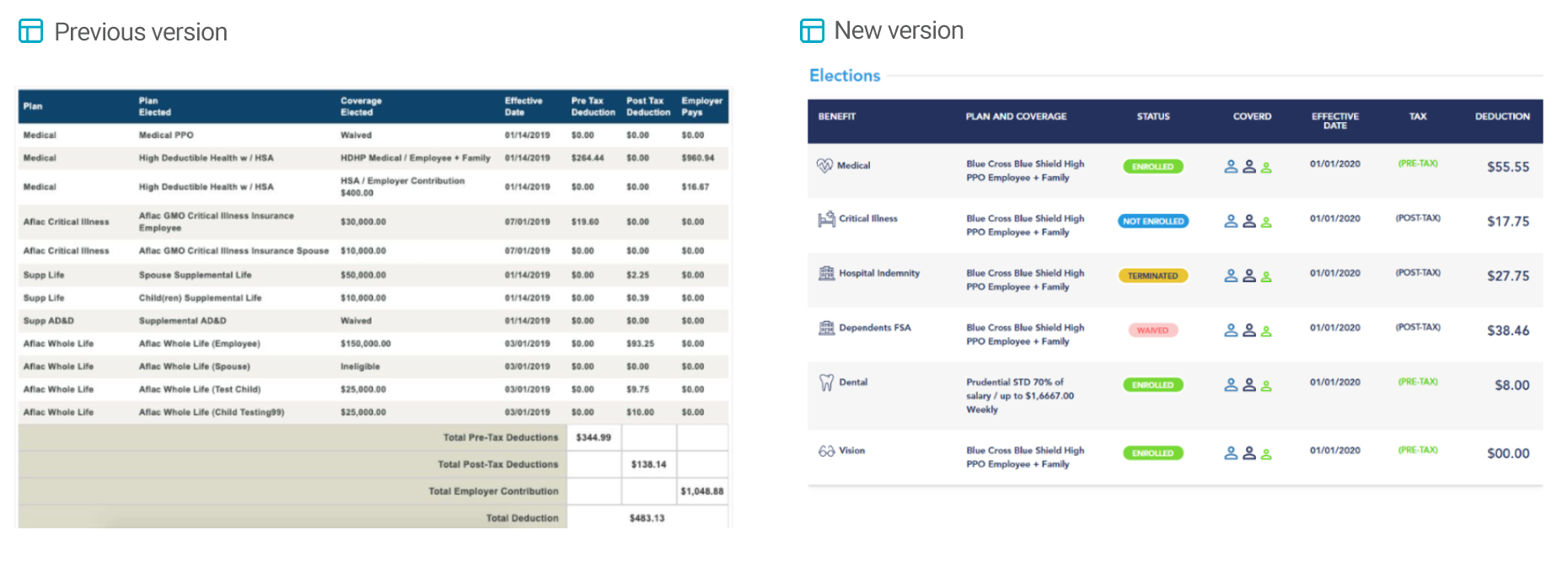
Tables
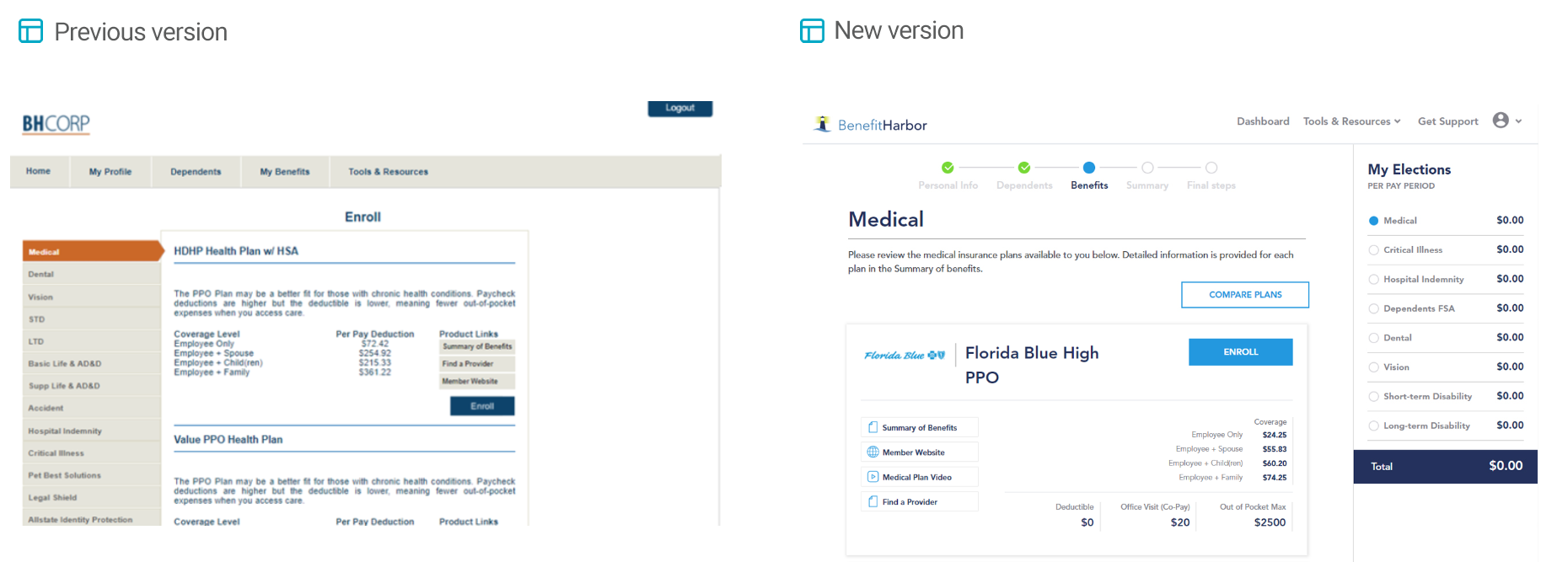
Product Enrollment page
Infographic and component
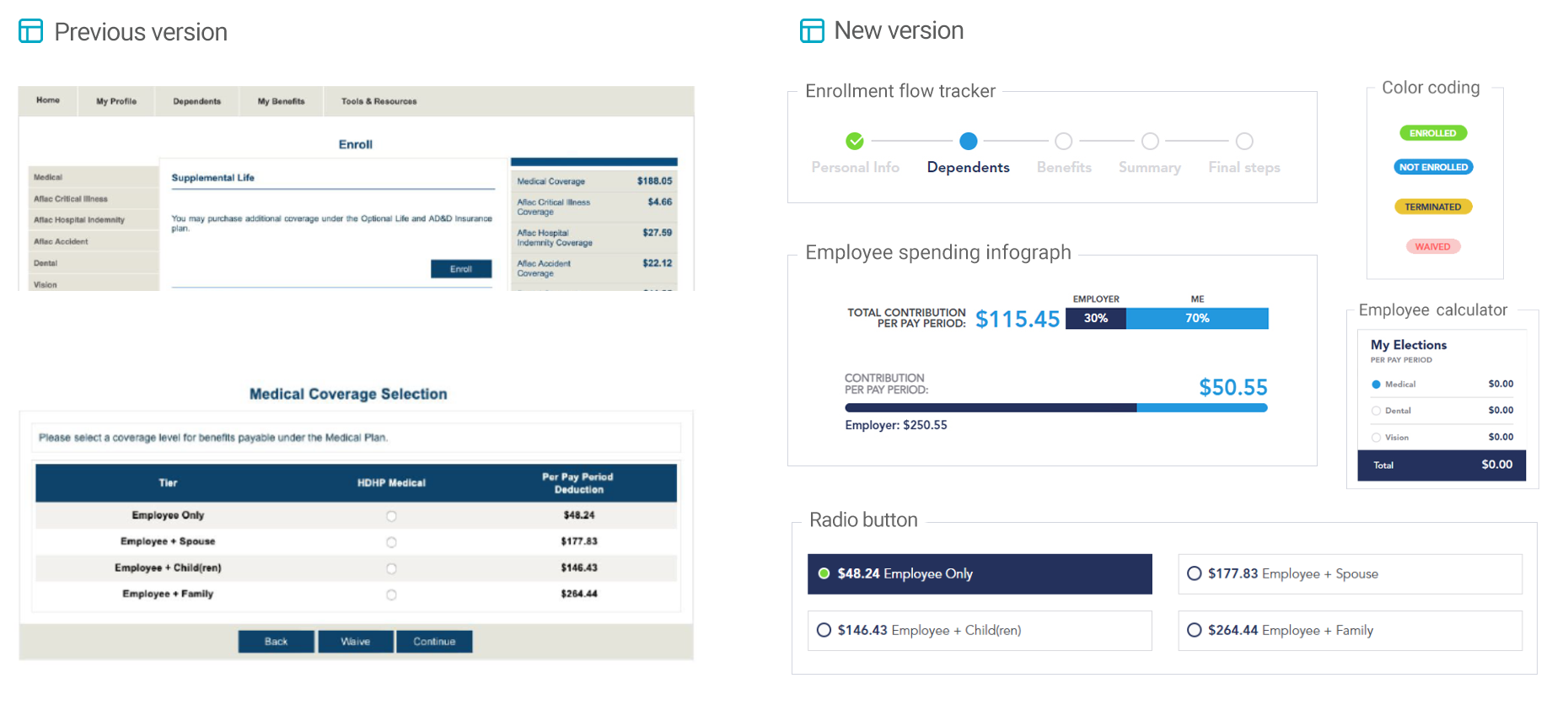
Visual Hierarchy
 Test
Test
What are users telling us that we can further iterate on? What went well? Where did users have difficulty?
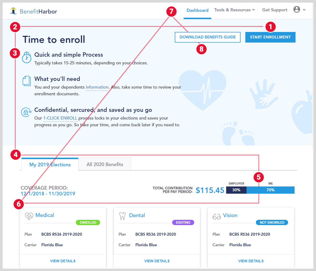
I created a prototype of the experience, both on desktop and mobile view, To verify and test this prototype we selected 4 operation team member and 4 call center team member. Our main focus was addressing our key metrics and ensuring they are easy to find and use, as well as, evaluating if the page was quickly scannable of the information that meant the most to users. In summary, the page on both desktop and mobile performed very well. Users were easily and quickly able to grasp the story, as well as, understand the key actions of the page.
Self-Service Appliation Screen
 Implement
Specifications and Delivery to Developer team
Alongside the Project details, we created a project brief outlining, including a section for design with a table of contents, Figma screens with details note and comments for developer team including
- Icons in SVG format, Background images in PNG, Color specification in HEX and RGBA.
- Font specificaiton with Header, Title and content text
- HTML Template
- CSS specification
- Details design styleguide
- Documenting feedback within Azure Devops
 conclusion
During this project journey we cover and implement User Experience. I would like to highlight some of which we including during this journey
- Divergent thinking & Convergent thinking
- Visual hierarchy
- System design
- Interaction design
- Design thinking
- Web accessibility 2.1